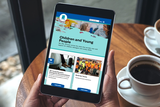
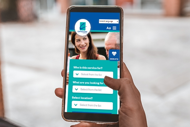
Time for a new website? That's what we suggested to Catholic Care and the improvement has been immense.
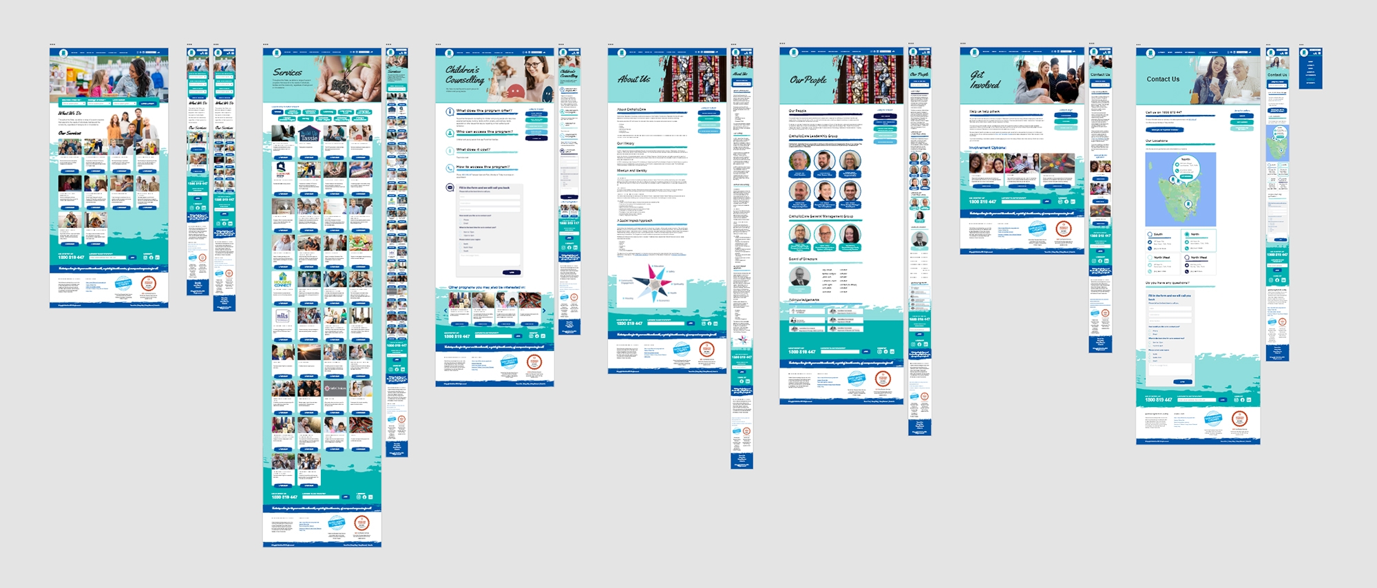
The design was developed to utilise their existing database, as much of the content was already there it just needed redressing. The new website now offers a friendly user experience that is easy to navigate - making use of colours, icons, images and the 'swish' motive inspired by their logo.
Why not take a look at their new website via the link above? And if you think you need a new website, then make sure to give us a call!


